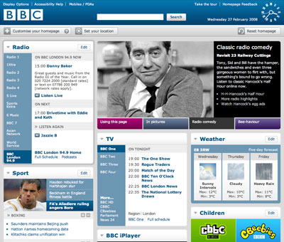
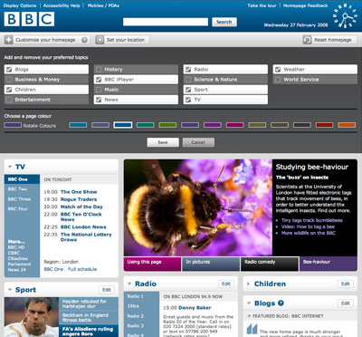
The new BBC homepage, launched today, allows users to customise their experience by selecting content and creating garish colour schemes. It’s hardly a new idea, but it’s well implemented, and if nothing else, it’s worth the admission fee for the kitsch analogue clock displayed in the header.


Please note – I despise the term Web 2.0, but as there’s no recognised alternative term that I can think of, I will continue to use it under duress.

