Archive for the ‘Accessibility & Usability’ Category

Fuel for thought

11th March

2008

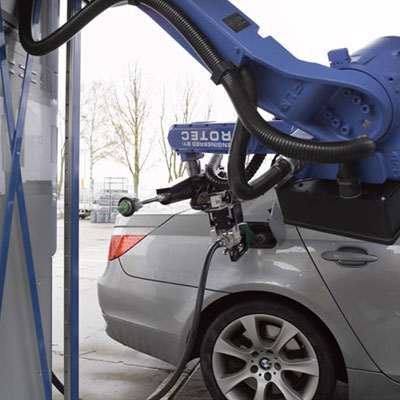
TankPitstop is the world’s first automated refuelling robot, allowing drivers to fill up at the pump without leaving their vehicles.

Tankstop1

You can see a video of the system in operation here. It’s very impressive, but it could be a hell of a lot quicker…

Auntie smells of Web 2.0

27th February

2008

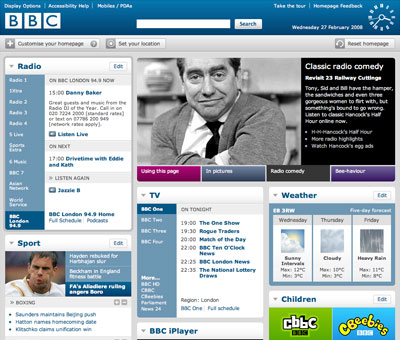
The new BBC homepage, launched today, allows users to customise their experience by selecting content and creating garish colour schemes. It’s hardly a new idea, but it’s well implemented, and if nothing else, it’s worth the admission fee for the kitsch analogue clock displayed in the header.

Bbchomepage2
Bbchomepage1

Please note – I despise the term Web 2.0, but as there’s no recognised alternative term that I can think of, I will continue to use it under duress.

Man has thumbs surgically altered to use his iPhone

10th August

2007

Gadgets: ever diminishing, ever evolving. Phones have gone from being 10kg beasts as used by Colonel Decker in the A-Team to waif-like slivers of metal and plastic that are invisible to the naked eye (well…. give it time).

This technological shrinkage is appealing to most people, but American Thomas Martel, frustrated by his oversized thumbs, has resorted to radical surgery to enable him to use his iPhone more effectively. The procedure involved shaving down the bones of each thumb, combined with muscular alteration and fingernail modification. Mr. Martel now has tiny, effeminate thumbs compared to his gorilla hands, but hey, he can write text messages a little quicker!

“We’re turning plastic surgery from something that people use in service of vanity, to a real tool for improving workplace efficiency” reasons Dr. Robert Fox Spars, renowned Frankenstein surgeon and all-round mad man.
Read more at Denver News.

Thumb

This is a random thumb from Flickr, not Martel’s!

Yahoo! redesign launches

24th July

2006

Yahoo! have launched a radical overhaul of their site this week. The emphasis seems to be on usability and speed of navigation: the homepage still features a large amount of information, but it now appears in a more user-friendly, aesthetically pleasing format.

Disappointingly, the homepage does not validate, but it functions very well with no page styling. I appreciate that Yahoo! are at the mercy of advertisers, and their site needs to display a tremendous quantity of information, but one would hope they’d take a positive lead with accessibility and W3C standards.

New features of the Yahoo! site include:

  • Searching can now be narrowed to a specific area by clicking on tabs for images, video, audio etc. (similar to Google’s homepage which shows images, Google Groups, Froogle and so on).
  • Favourite items, information and searches can be stored in the navigation, accompanied by reasonably pleasing little icons.
  • A “Yahoo! Personal Assistant” can provide you with a quick, at-a-glance view of what’s happening in your (Yahoo!-orientated) world.

Yahoo

SitePoint interview Jakob Nielsen

19th July

2006

The popular SitePoint author Matt Mickiewicz has interviewed Jakob Nielsen, the usability evangelist (or usability fetishist, depending upon your perspective), on AJAX (deemed “irrelevant”), contextual text links (described as “disgusting”) and other related web technologies.

The full article can be viewed here, and it’s well worth a read. Nielsen is as provocative and opinionated as ever, but he does make some very valid points.

ClickTale user interaction monitoring service

13th July

2006

ClickTale is an intriguing website statistics and monitoring service which creates movies of users’ individual browsing session. Every mouse movement, click and keystroke is recorded for future playback.

Clicktale

This service will be of great value to many websites, particularly online retailers: seeing how customers browse and interact with their stores will enable them to maximise revenues by making site optimisations based on user behaviour. ClickTale also promises to revolutionise accessibility testing: rather than blindly applying best practise methods and hoping for the best, developers will be able to analyse user sessions to identify usability issues.

Of course, like every good web2.0 service, ClickTale is running a closed beta, but if it does deliver as promised it’s sure to win many admirers.

CSS3.info launched

12th June

2006

The author of the CSS3 preview page, Joost de Valk, has launched CSS3.info, a site dedicated to information about CSS3.

For more information on CSS3, check out:

http://www.w3.org/Style/CSS/current-work 

HTML email – tables or CSS?

7th June

2006

David Greiner has written an interesting article on HTML email for Vitamin.

As a co-founder of Campaign Monitor, there’s little doubt that David knows a thing or two about HTML email. The article contains invaluable information on email clients, image usage and general advice on message content and structure. (Note the lack of discussion on multipart email – Campaign Monitor appear to strongly favour HTML-only messages, which are a big no-no in my book). However, I’m not convinced by his suggestion that CSS is a viable option when creating HTML emails. Now, don’t get me wrong, I’m a real advocate of standards and accessibility, but the same rules don’t apply to HTML email.

Tables are the lowest common denominator – they’ll work pretty much anywhere. CSS HTML emails are sure to be the answer in the future, when consumers and businesses alike have migrated to newer email clients, but for the time being, use tables if you want your email to email campaign to be a success.

Accessibility colour wheel

31st May

2006

An interactive colour wheel showing the accessibility of different colour combinations, based on formulas provided by the W3C:

http://gmazzocato.altervista.org/colorwheel/wheel.php